Great Fonts to Use for Self-Publishing
This article came about because of a particularly busy day where I received over a dozen manuscripts in one hour. While opening these, going through them to make sure they opened, sending them to editors, etc., something struck me.
ALL THE BOOKS USED THE SAME FONT.
Seriously. And I don't mean just the body font. ALL of it. And a few did something fancy with their title page…until I found two different authors using the same stale, dated font that comes with Microsoft Word. These were PUBLISHED books that could have used a lot of love with some layout help - and the easiest part of that is font.
So I decided a blog about fonts is in order!
You may feel a bit stuck when it comes to picking out a font for your self-published book. It's essential that your font for your text be readable and not too distracting, but that doesn't mean that you have to stick with Times New Roman or Calibri like you did for any papers you had to write for school. There are so many unique fonts available, and many are available to download for free. Yes free! ALL the fonts we talk about here can be downloaded for free with a commercial license. The self-published author's best friend! Your book's font can help set the tone and mood for your story, and it can make a big difference to your readers. Don't forget that you can always use "boring" fonts for the body of your book but spice it up with the chapter headers and/or title page.
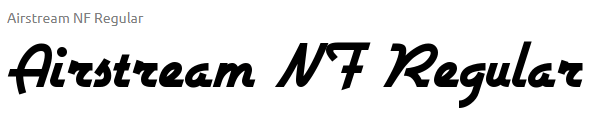
Romance
So let's talk about what's actually realistic regarding feedback. Authors love beta readers because they actually tell them the truth about their book. They say whether they like it or whether they hate it- but it's a lot more than just that.
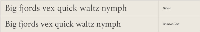
For romance novels, you can’t really go wrong with Crimson Text. It’s similar to Sabon, but it’s available for a free download. It’s clear and easy to read, but it also has a slightly romantic and elegant feel, which helps set your romantic story's tone.
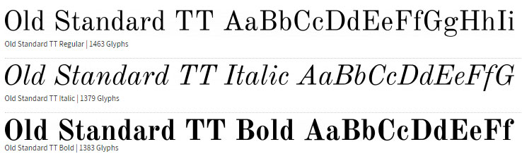
Old Standard TT is another excellent romance font. It looks a bit old-fashioned, so it would be great for a work of historical romantic fiction. This font would be perfect for any story set in a castle or old manor house.
Didonesque is another font that has a vintage and romantic feel to it. It’s a beautiful and readable font and would work well for many different genres, but especially for your romantic novel you’re looking to self-publish.
![]()

![]()
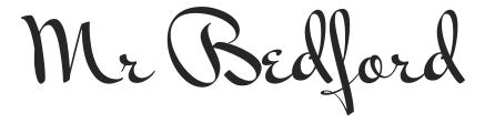
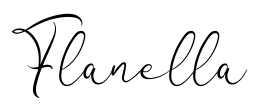
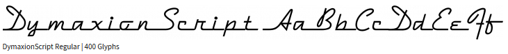
For header text, you can get much more creative because you don’t have to be so concerned with readability. There are a lot of great romantic fonts out there.
![]()
Science Fiction
Arrow is a super easy to read font, while also being very distinct looking. It would definitely set your book apart when used in a science fiction novel.
![]()
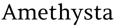
Amethysta Regular is an academic looking font, but it has some subtle differences from Times New Roman.
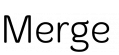
Merge is another great option for a science fiction font. It’s a bit more light-hearted feel to it, so it would also be good to use in a story that has a bit of humor involved as well.
Here are some creative options for chapter headers:

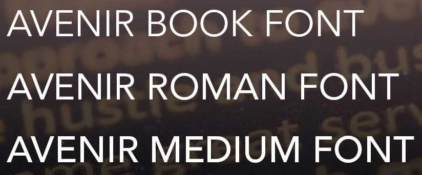
Dystopian
For a futuristic dystopian novel, Avenir is a great font to use. The word “avenir” is French for “future,” so it makes sense that this would be a somewhat futuristic-looking font. It’s simple and readable while also being geometric looking, which hints at something futuristic.
Helvetica is another modern-looking font that would be good for a dystopian story. The realist design gives it a very modern feel, very similar to Avenir.

RM Almanack is an almost edgy looking font and would really add an eerie feel to your dystopian novel. It’s a very bold font choice, though, because it stands out quite a bit from others, so don’t make this choice without considering it carefully first. But while it is very unique, it still maintains that aspect of readability, which is key for your readers.
![]()
Here are some options for chapter headers:


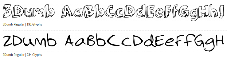
Fantasy
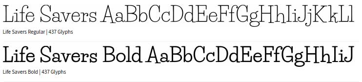
Life Savers has a very unique feel to it. It comes across as fun and quirky, and it would work great for a young adult fantasy novel.
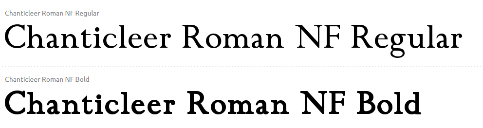
Chanticleer Roman is another excellent font for fantasy novels. Without being too distracting, this font is unique and will help make your self-published fantasy novel stand out. When it’s bolded, it looks great for chapter titles as well.
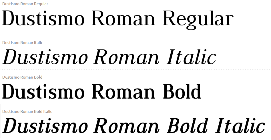
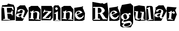
Dustismo Roman reminds me a lot of the font in the Mortal Instruments series, so it’s something I associate with fantasy books in general. Overall, it would be an excellent choice for your self-published novel.
Here are a few great options for header fonts:

Mystery and Thriller
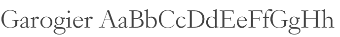
For a good mystery and suspense novel, Garagier is a good pick for your self-published book. It’s a fairly versatile font and works for a lot of things, and it has a modern feel to it. Like most of the fonts in this article, it’s very easy to read.
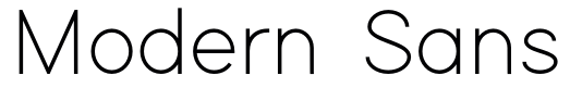
Modern Sans would be a great font for a good detective suspense novel. As the name of the font implies, it looks very modern, and it almost looks like something out of a newspaper or textbook. The font itself just seems smart, which makes it seem like you’re in for a mind-binder of a story.
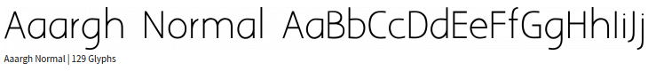
Aargh Normal is a pretty standard looking font but with slight differences from the ones that are used most often. It has a slightly academic feel to it, so it would definitely be a good one for books containing a detective story.
Here are some thrilling options for chapter headings:

Memoir
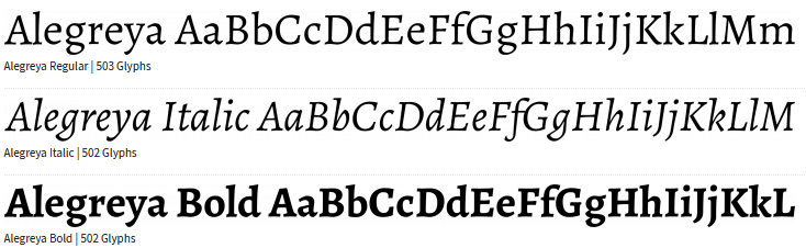
Alegreya is almost the same as Times New Roman, so it would be great for any self-published book, but especially for a memoir because it does have a very nostalgic feel to it. It’s definitely a great way to enhance your writer’s voice in a very low-key way.
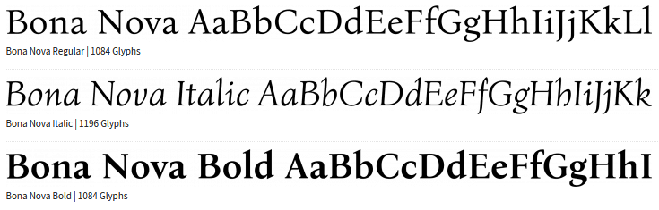
Bona Nova is another excellent font for self-published memoirs. It again has some tiny differences from the basic Times New Roman, which means it won’t be distracting at all to your readers. Something awesome about this font is that it also looks great italicized, so in areas where you have italicized words for emphasis, it will look beautiful on the page.
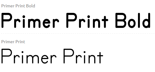
Primer Print is another fun font for a memoir with a unique voice. This would work well for a more comedic memoir and would work great for coming of age stories.
Here are some fun chapter heading fonts:

There are so many great fonts out there to choose from for your self-published manuscript! The number one important thing to remember is to keep your readers in mind. Be careful not to use anything that would be distracting or hard to read for your readers because you don’t want to distract them from the most important thing—your story. But you can still be unique and pick out a great font from all the beautiful choices available. The sky’s the limit.
![]()
Is your story polished and totally ready? Do you need beta reading? Hear what some authors have said about their beta reading experience.
Thanks for your help with my special circumstances and the timely response from the beta reader. - Karen
Thank you so much! Please extend my thanks to your beta reader. Her insights were excellent, and will help me improve my story. - Z. B.
The feedback is instructive. I am glad we went back to repeat readers as they are confirming there were improvements in the areas I and my editor targeted. - M. T.
Wow! That was fast! ;) Loved the feedback and critiques… I was just picturing some comments in a Word file, so you guys went above and beyond with in-depth reporting! I’ve sung your praises over at Goodreads, so hopefully someone will get the hind and some business will come your way soon. :) Thanks again so much! These stories will be better because of you, and I’ll be sure to contact you again next October when I publish them so you can all get your complimentary eBooks. (The perks of being self-published…) - Jack
I will use all these comments to improve my story. I will definitely use your services again. - Georges E.
What a wonderful and necessary service you provide - this is exactly the kind of feedback I was hoping for. If it is possible, could you please thank the beta readers for me, and especially pass along my thanks to the second reader (EML36) for the thorough comments and insights? Combining the viewpoints and thoughts of the three, I now have some indication of what worked and what will need revision. I hope to make use of your company again sometime soon. All the best. - David A.
Thank you very much for these reports. I like how they're crafted, and they're of big help for me. - Cristelle C.
Thank you so much for this beta reading. It is so helpful and will help me revise the book appropriately to be even stronger. I will recommend your services to anyone who asks. Thank you, thank you, thank you! - Rachel L.
I want to thank you for your great service, they were truly awesome betas! - Tanor C.